 |
| Mural by Michael Yaikel |

INTERNATIONAL ART COLLECTIVE - DAILY POSTS FROM LOS ANGELES, CA.
Tuesday, July 31, 2018
Monday, July 30, 2018

Sunday, July 29, 2018

Saturday, July 28, 2018

BODEGA ISLAND VLOG 4
THE BODEGA ISLAND VLOG : Write, Record & Release A Song In Under 4 Hrs | The Bodega Island Vlog Ep #4
Friday, July 27, 2018

Thursday, July 26, 2018

Wednesday, July 25, 2018
REVIEW - Brett Hollis


For a long time, I found Brett Hollis’s work beyond definition. Brett makes paintings, zines and digital creations; bizarre genre defying works, that intentionally explore the realm of kitsch. I first fell in love with a work titled ‘Vacation Treadmill.’ It certainly had an air of absurdism. The protagonist is an out of focus blob. The work seemed to embrace repeatedly digital mistakes. The choppy digital collaging with some lines clean and some blurred form truly unique patterns. ‘Shape Landscape #1’ utilizes similar elements. 8-bit pixelation blends with smoother airbrushed lines in some unusual ways in many of Brett’s work.
Figure work’s such as ‘The Country Boy,’ ‘The German Painter,’ and ‘The Gatherer’ show a commitment to a series and an evolution of his vocabulary of digital expressions. The layering and blurs are more controlled. The neon digital forms are more sophisticated and detailed than before. The works still straddle the unexplainable but with more awe.
The text in the zines has a nihilistic humor that many would appreciate. Hopefully more artists take the risks that Brett Hollis takes. Buy the zines, and follow more creatives like this @sharks_eat_meat .
Review by John Coulter

Tuesday, July 24, 2018

Monday, July 23, 2018

Sunday, July 22, 2018

Saturday, July 21, 2018
BODEGA ISLAND VLOG 3
THE BODEGA ISLAND VLOG :Is Perfectionism An Excuse To Procrastinate? | The Bodega Island Vlog Ep #3

Friday, July 20, 2018

Thursday, July 19, 2018

Wednesday, July 18, 2018
REVIEW - Mythofuturiddim
There was a cool pop up group show in Bushwick, Brooklyn this week titled Mythofuturiddim. A.C Evans curated a strong group show with artists Bree Person, Harlan Ballogg, Pixel the Artist and Wi-moto Nyoka. The show included strong fluorescent contemporary works commanding a bold street art style with a fresh vaporwave aesthetic.
Vivid portraits in bold colors show off the painterly talents of Harlan Ballogg. One of the more thoughtful and less flashy pieces in the show was by Bree Person. Person’s conceptual piece related to urban spaces and used large beautiful natural imagery. Some of my favorite works were by Pixel the Artist. The bright colors and surreal cartoon worlds grabbed my attention. The quirky details and clever color schemes kept me engaged.
Support and follow these artists, visit their sites and buy their work. As always follow SharksEatMeat and check us daily for all your art and culture news.
Review by John Coulter
Mythofuturiddim @mythofuturiddim
Bree person. @bree_person
Harlan ballogg @harlanhue
Pixel the artist. @pixeltheartist
Wi-moto nyoka. @duskyprojects
 |
| Painting by Harlan Ballogg |
 |
| Painting by Pixel the Artist |

REVIEW - Derek Hansson

Derek Hansson
Derek Hansson is a painter and writer from Texas. Derek’s work has a raw strength and boldness few can match. He has a healthy obsession with Van Gogh’s techniques but offers a more colorful palette than just blue and gold. Derek’s thick textured marks and wild colors recall the fauvists. The complexity of many of his palettes is what makes the work so alluring. Much as Matisse’s ‘Green Stripe’ uses non-local colors, Derek’s figures and portraits are full of powerful reds, greens, violets, and golds. They give an intensity to the subjects.
His allegorical scenes are just as delightful as his portraits. They depict anarchy and angst with a playful charm. ‘Demons’ shows us a reclined self-portrait surrounded by a rare collection of hellish monsters. Birdmen, headless creatures, and skeletons haunt the hero in this work. ‘Roadkill Jam Session’ uses slightly more neutral and naturalistic colors while maintaining a folk-art style. As an artist and a musician, I personally enjoy visual art about music. This work has a shamanistic quality because of the presumably dead animals and skeletons present. It makes the viewer imagine what music they might play. Derek paints both portraits and social scenes with great skill and sensitivity. With ‘Monsieur Bumpos’ Derek shows off his painting prowess. In a fantastic way the beard looks like sprinkles, the sky afire, and the skin iridescent, and yet behind it an earnest man with a deep expression is present. Works such as ‘Death’ explore some of society’s most horrific moments.
Follow Derek Hansson’s blog and Instagram, and look for more of his work here @sharks_eat_meat .
Review by John Coulter


REVIEW - EUGENE
There was a new solo show at The Living Gallery in Bushwick this week featuring Eugene. Eugene uses comic book style to comment on pop culture and the art world. The funky portraits of faces you recognize and some you don’t, tell short jokes that keep the works entertaining. The bright colors and simple style remind one of Sunday morning comic strips with a Matisse like simplicity.
The show had a DJ and a lively turn out, showing that the alternative art scene in Brooklyn is going strong. Follow Eugene @eugene.art and look for more of the shows. As always follow SharksEatMeat and check us daily for all your art and culture needs.
Review by John Coulter
@eugene.art
 |
| Artwork by Eugene |
Tuesday, July 17, 2018

Monday, July 16, 2018


Sunday, July 15, 2018

Saturday, July 14, 2018

BODEGA ISLAND VLOG 2
THE BODEGA ISLAND VLOG : Eating Healthy Is Not A White Thing | The Bodega Island Vlog Ep #2
Friday, July 13, 2018

Thursday, July 12, 2018


Wednesday, July 11, 2018
Tony Ortega - Review

TONY ORTEGA
Tony Ortega is a staple of the Colorado art community. A teacher and artist for over 30 years his socially conscious murals, paintings and drawings enliven Denver’s streets and walls. His works have all of the social dialogue of a Diego Rivera with the wild expressionism of a Gauguin.
His paintings tell the stories of migrant workers and families. Scenes of schools, farms, streets and residences are given a personal view that is often neglected or ignored. Bright colors celebrate the subjects in an earnest manner. Paint and pastels are treated similarly but the forms in his paintings are stronger and more solid. Expressive colors exaggerate personal emotions in his social scenes. Ortega emphasizes an individual and social responsibility throughout his works. Many of the figures are faceless, allowing the viewer to relate to the anonymous character in scenes where everyday life is combined with magic realism.
Ortega eloquently expands upon the Chicano experience while staying true to its traditions. Everyone likes Latino food, but it’s time people experienced more Latino art and music. Look for Tony Ortega’s murals around Denver, follow him online, and look for more of his work here @sharks_eat_meat .
Review by John Coulter


REVIEW - Aaron Johnson & Mu Pan


Aaron Johnson
Aaron Johnson’s New Paintings at Joshua Liner Gallery are amazing. The works are like a family photo album of Grosz’, Kirchner’s, Goya’s and Picasso’s. Each painting features piles of twisted knotted faces. Stacks and grids of portraits with no bodies is a format we are used to seeing by 2018. From mugshots, to yearbooks - from Facebook’s feed to Instagram’s - the wall of faces is nothing new. The hobbled raw aesthetic here is what’s fresh. The faces fade in and out like an interconnected web. While any of these portrait formats may not have been the artists intentional reference the concept of representing the human face has evolved on the shoulders of past iterations. Johnson’s paintings blend the lines between the social and the individual.
The color in the work is top notch. They are way more complex than a bag of Skittles with color schemes that utilize a full palette. On par with how Gauguin, Cassatt or Renoir exaggerated non local colors and gave them deep saturation - Blues turn to purple or indigo and bright greens and oranges splash most faces. Johnson’s work has a similar frenzied energy to Despina Stokou’s paintings. While Stokou specifically paints texts and emojis both are painters who capture the spirit of our contemporary world.
Aaron Johnson is a clever artist and a dedicated painter who pulls no gimmicks. He’s very true to the medium. Stay tuned to SharskEatMeat for daily contemporary art, regular reviews and all your art and culture needs. Visit Joshua Liner Gallery in Manhattan and follow their Instagram for new exhibitions.
Review by John Aaron Coulter


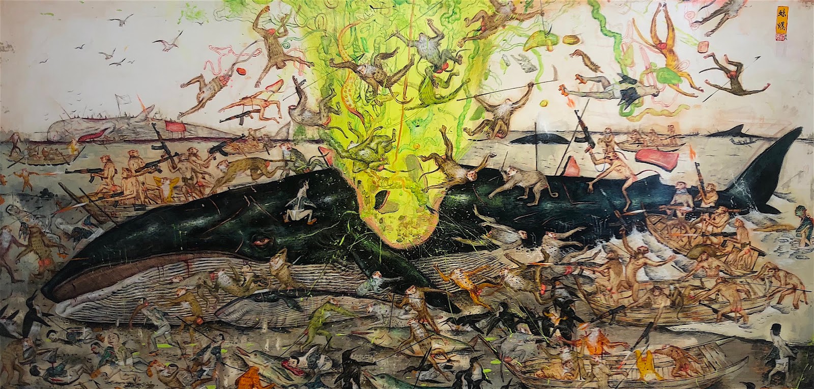
Mu Pan: Bright Moon Shines on the River
Mu Pan’s show Bright Moon Shines on the River at Joshua Liner Gallery is one of a kind. While the concept didn’t grab me, it certainly confused me, I’m not bothered. In fact I’m very intrigued. Despite never finding a solid conclusion about the work’s theme, the sheer quality of the work allows them to stand on their own. The work’s plot is adequate as a mystery to me. A million stories can be injected in to the chaotic scenes, and the variety of interpretations gives them strength.
The paintings rival the expansiveness of any Mughal court scene or Bosch. The depth and scope of the scenes are as vast as the artist’s imagination. Never a single portrait but entire surreal and chaotic societal scenes. I’m talking Paolo Uccello’s “The Battle of San Romano” chaos. And yet they are rendered in a way so different than meaty antiquated battle scenes. The brush strokes are soft and furry with many figures left open. The lack of solidness allows easy movement through the chaotic scene; in fact it creates its own dynamic sense of movement. The smooth but dense mark-making on the figures is similar to how Klimt treated a figure’s skin.
Support Mu Pan. Visit their website and go to their shows. I highly encourage collecting these if you have the opportunity. They are ridiculous. They are the types of works you could stare at for hours and hours - longer than any Netflix binge, and still discover something new. They are excellent conversation pieces. Follow Sharks Eat Meat for more daily art and culture news.
Review by John Aaron Coulter

Tuesday, July 10, 2018


Monday, July 9, 2018

Sunday, July 8, 2018

Saturday, July 7, 2018

Friday, July 6, 2018


Thursday, July 5, 2018


Wednesday, July 4, 2018

Subscribe to:
Posts (Atom)